

Smashin’ it, with Chloe Ting

Introducing Chloe Ting
Chloe Ting is an Australian fitness Youtuber that became famous during quarantine through her various fitness challenges. Challenges range from 14-28 days or longer and can help people lose weight, get toned, and build muscle. Her challenges can be found on here website, https://www.chloeting.com/program/.

Courtney Lee
Courtney Lee is an aspiring UX Designer who loves helping others through design. The main goal of her work to make a positive impact on others and create fun and intuitive designs. In the future, Courtney is interested in working in industries involving mental health and fitness. She is particularly interested in the future of social media and the ethics involved in the rising technology with AI and machine learning.
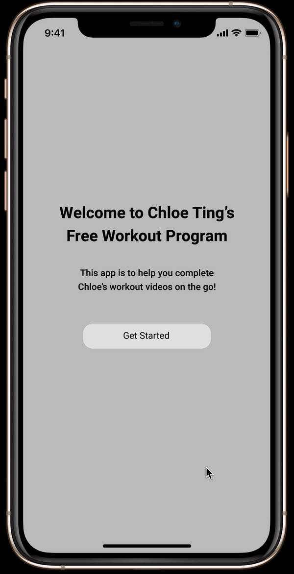
About my project
As a Chloe Ting subscriber, I’ve found it hard to use her website on my phone and wanted to use my UX design skills to conceptualize an app to be apart of her brand.
Chloe’s website is perfect for when you’re working out at home and are just using your laptop to follow videos. You just go through each challenge day and each video is played on Youtube. However, Chloe’s website on a mobile device is not user-friendly, inevitably forcing users to only be able to work out from their laptops.
My Process
I began this project by thinking about how an app could function with Chloe’s current site. I created the following assumption:
If Chloe Ting users would download an app of hers, a required login will deter them from using the app as the current website enables anyone to complete a challenge.
To understand what users may prefer, I mocked up 2 versions of the app, one version with a login, and one without.

No Login-mockup
This mockup is a sign-up free experience
Login Mockup
This mockup experience requires users to have an account to continue
Feedback
Next, I wanted to receive feedback from users. Before showing them the 2 mockups above, I had each of them navigate Chloe’s website on their mobile device & conducted think-aloud testing. Some notable quotes from the think-aloud testing were:
“The text is kind of small & it’s hard for me to tell what I’m looking at. I wish it was more organized because they’re [the videos] are all just lumped in together.”
“I don’t like how it opens up Youtube when you click the workout. It takes you to the Youtube app and you can’t go back to the workout [page].”
Next, I showed the users the login & non-login mockups of the app. I found that all 3 users:
Liked how the challenges were more organized & easier to see (in contrast to the mobile website layout)
Were all in favor of personalization of their workout experiences & wanted a way to see their progress to keep themselves accountable.
Given this feedback, my assumption was proven to be incorrect.
If users are going to make the effort to download an app, they want to see more than what they are being offered currently.
With some additional feedback, I went on to create a version of the app that included an optional sign-up, which combined both of my first 2 prototypes.
Final Prototype
Challenges & Learnings from this Project
Although this project was rushed in many ways, I learned that it’s okay to start a project based on an assumption and then later pivot if needed. The way I went about this project wasn’t straightforward in any way and oftentimes, it was difficult for me to feel sure of what I was doing. My next steps would be to show this prototype to more users and receive more feedback to see what could be improved! If you have any thoughts on what could be added, please feel free to email me at courtneylee9001@gmail.com :)